 Law By Design
Chapter 3.1
Communication Design for Lawyers
This section is intended mainly for people working on legal designs, but it can be applied to all kinds of other situations. The different sections of resources are laid out sequentially, to guide you through a communication design process. But feel free to jump to the section you need.
What is Communication Design?
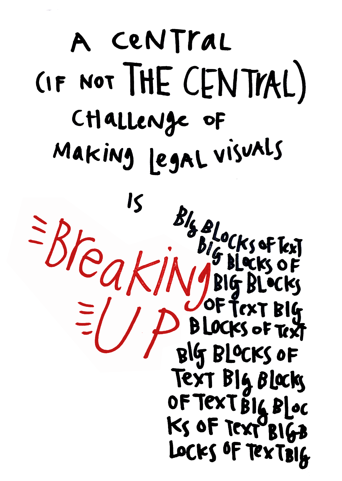
Communication Design is the use of color, text, composition, and other elements to get a message across to a user. Visual design and graphic design are subsets of communication design -- they focus on how to use visuals to communicate information.Other types of communication design may go beyond visual elements -- bringing in senses beyond sight, using more visceral ways (like sound, motion, vibration, smell...) to get a message across. But here, we will primarily look at how we use visual elements to convey information & emotion to our target audience.
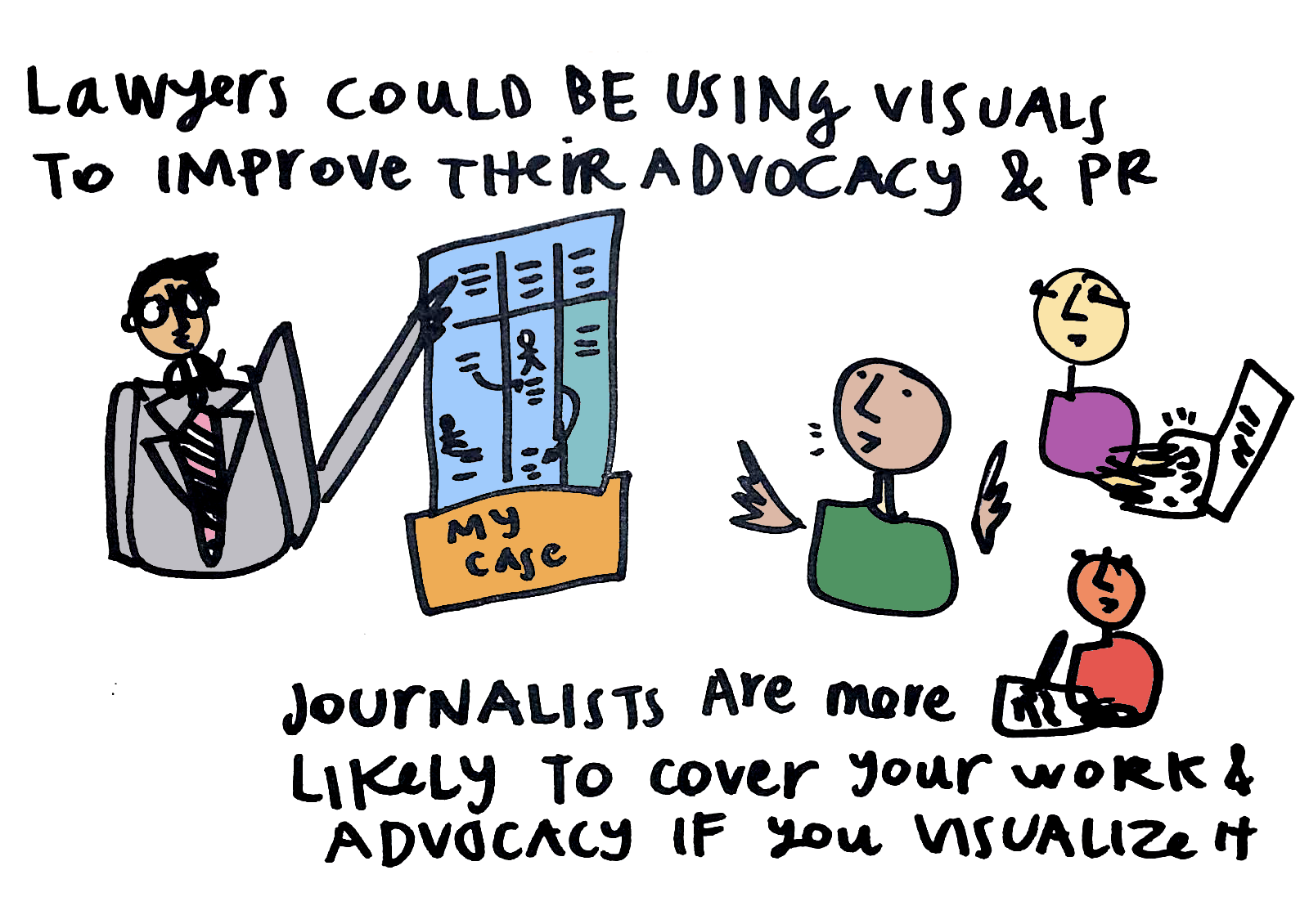
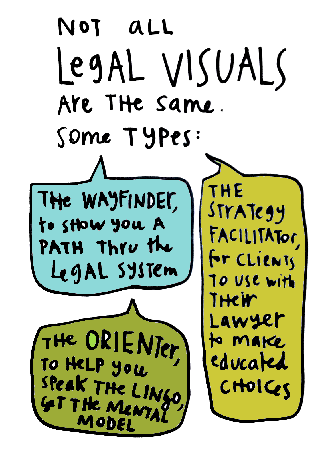
In the legal world, we often use design to communicate complex information. We can see two main types of complex communication design: that to help our user understand complex info better, and that to help our user make better decisions for herself.
If you are embarking upon a communication design process of legal material, it is worth thinking what type of complex communication design camp you're in. There are different design patterns and elements to use for the two different types.
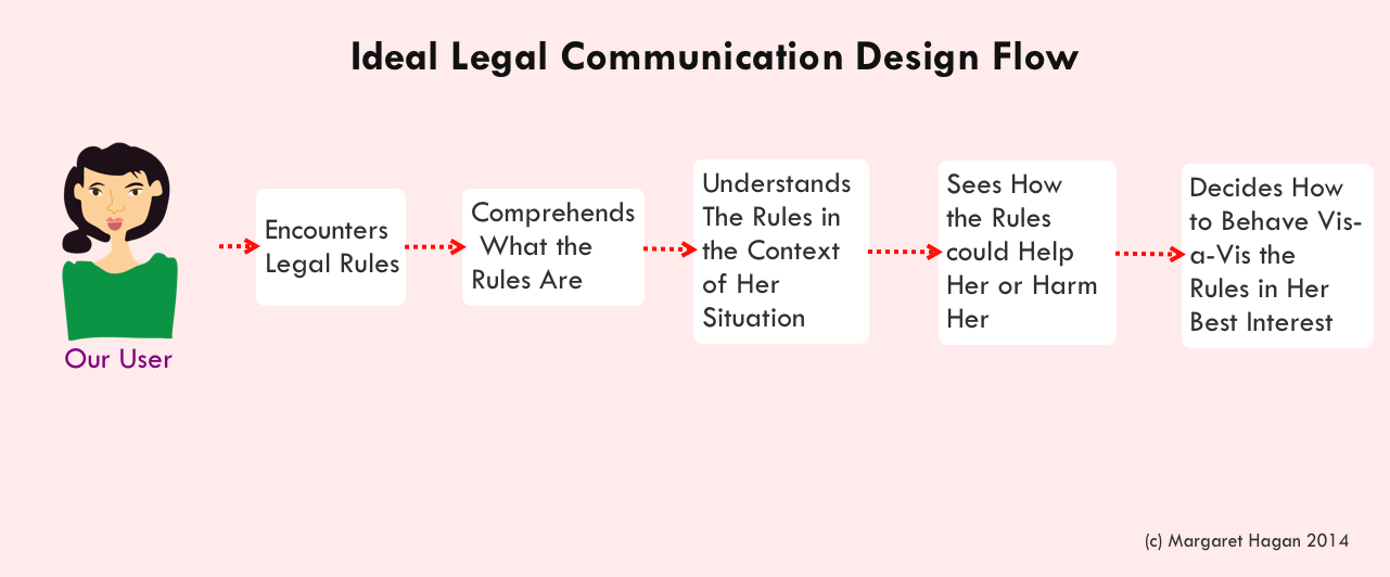
For the second type of communication - Decision for better decision-making, you should aim to instigate the following process for your user. Ideally, your design will help the user when she's entered into the legal system in some way, to understand what the system's rules are & how they apply to her. If you do this effectively, then she will be able to apply the rules to her own life situation and make a decision about how to navigate the system. Good legal communication design will empower your user to be smarter & strategic when making her way through a legal process.
Principles
The central principle for a communication designer to abide by, is to be in service. All of your choices during the design process should be in service of two things:- Following the Content Itself
- Serving the Target User’s needs
When you are putting together your visual, be creative & inspired. Try to find your own distinct voice, that avoids cliches & popular templates, so that your design will have a stronger power to engage your target users.
There are some universal design principles to know while putting together any visual. Try to internalize these & deploy them when you're assembling an image, composing a document, or designing any other visual communication.
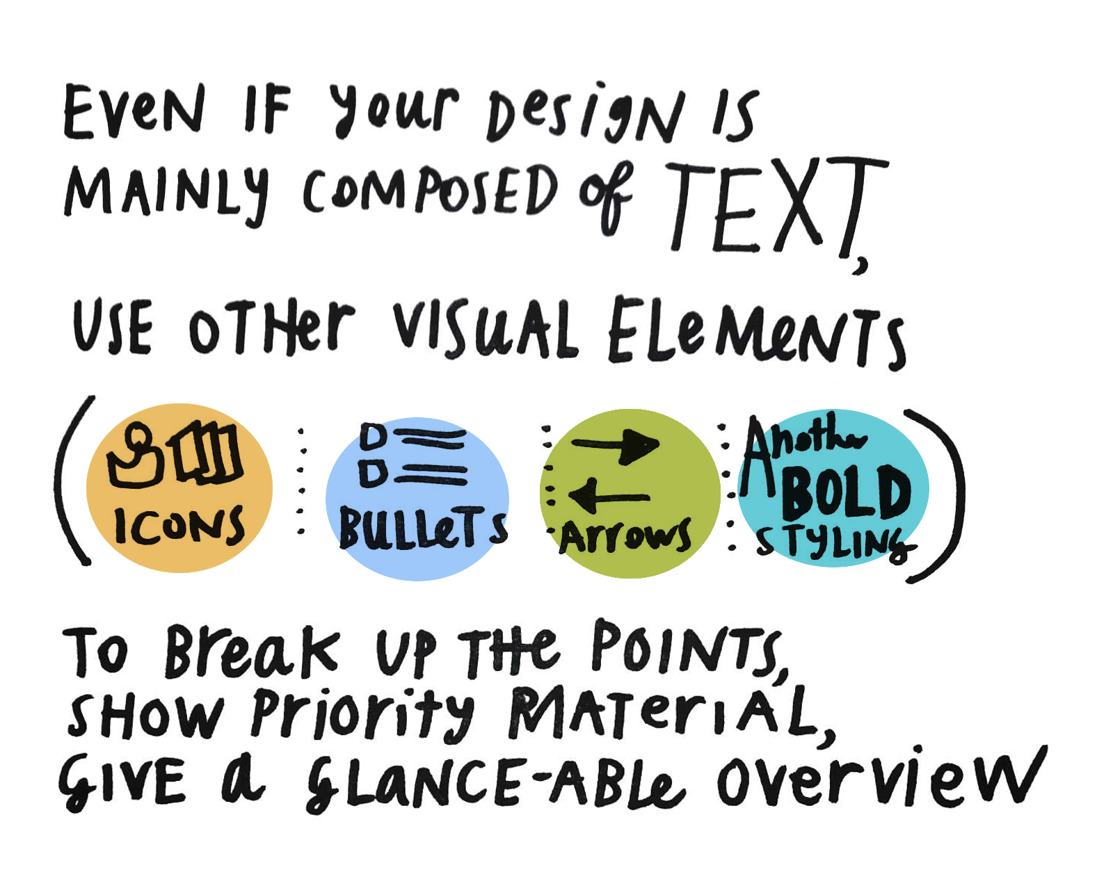
Put in a list form, here are some of these Essential Principles for good visual design:
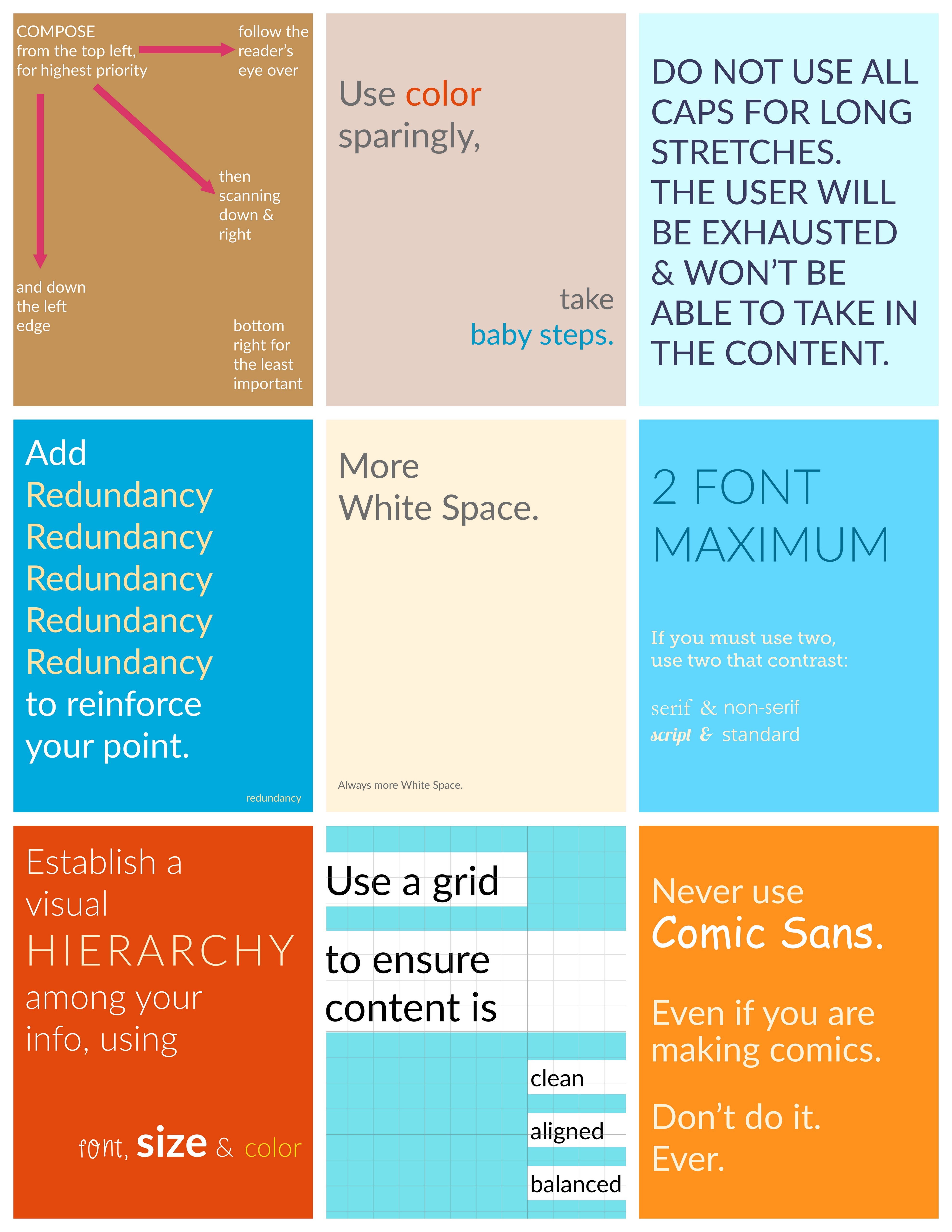
- More White Space — always more white space — let the eye breathe
- Establish a hierarchy of information — using differences in size, bold/italic, color, or style
- Two font maximum -- do not use more than two different fonts in one document -- using one can often be preferable
- Use color sparingly, carefully, intentionally -- and know the cultural & emotional triggers you're invoking with the color you choose
- Add redundancy to keep reinforcing the key point
- Use a grid to get your composition clean & pleasant -- make sure objects & type are aligned as much as possible
- Compose from top left-corner down & over — most important things up there, and then following the user’s natural eye-flow
And to go with the Principles, here is a complementary list of Essential Design Prohibitions:
- Never use Comic Sans
- If you are using more than one font, don’t have them be from the same style or the same class (both serifs, or both sans serifs) — they should contrast heavily with each other to go well together
- Avoid font size that is tiny — try to stay in the 12pt-16pt range for body copy
- Avoid ALL CAPS for important things — it is unreadable after a few words, people will tune it out
- Avoid too much bold, use it very sparingly for only the most important bits of information
- Don’t make your lines too long or too short — ideally 50-70 characters per line, counting the spaces
- Don’t type on an image (meme-style) without putting a background fade under the type or a transparent layer over the image, to make the type clearly visible
- Have images & other visuals point towards the content — not facing away
After you have made your design, you can go through a short Visual Design Checklist to ensure it abides by some of the key visual design principles:
- Have you made a clear hierarchy of what is most important to least?
- Does this design help your target user achieve the goal she’s interested in?
- Will this form of the visual fit your user’s context & environment?
- Have you highlighted the key relationships — whether they be steps, contrasts, or comparisons-- to make them obvious to the user?
- Have you aligned the elements, gotten them lined up along a clear line or grid?
- Have you given your user’s eyes a break with white-space?
Communication Design Process
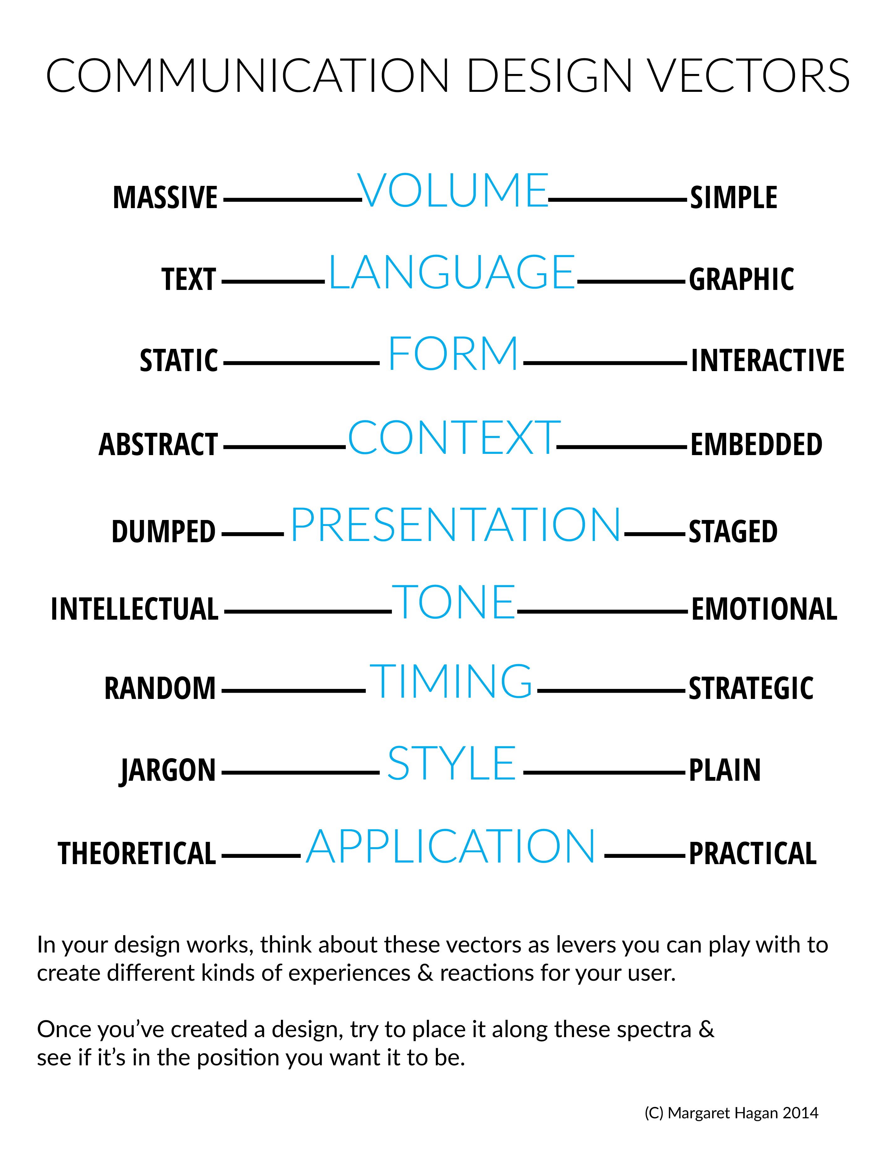
In your design work, think about the following vectors as levers you can play with to create different kinds of experiences & reactions for your user.Once you’ve created a design, try to place it along these vectors and see if it’s in the position you want it to be. These can be used as a checklist to see if you are on the right place for the type of design you're making. Most of the time, you want to be on the right-hand side of the spectra -- but sometimes you may need or want to be on the left.
Just be intentional with your design, so you know what is appropriate for your audience & your content -- and that your design choices fit their needs.
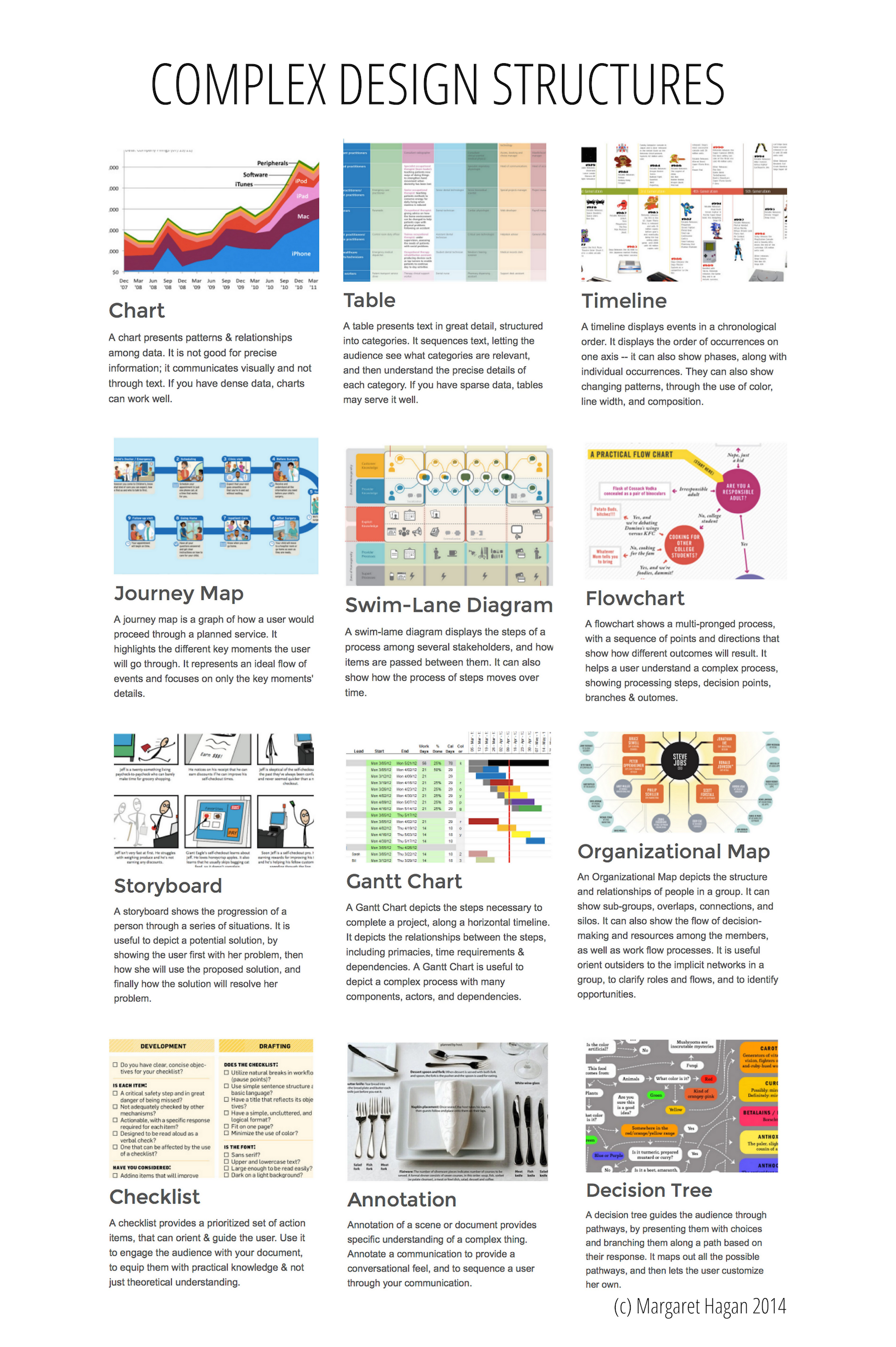
One of the key decisions to make during your visual design process is what form your content should be visualized in. You have many options, but typically your content will lead you to a specific type of visual as an optimal one. Here are some options for complex communication design forms: 
Want some more insights into what makes afor a good design?
Here are some key takeaways that we've learned in our work ...